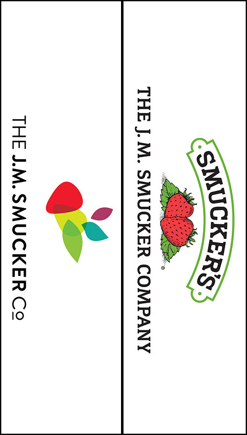
The way that I see it, I imagine that sometime in the near future, the pendulum is going to start swinging back in the other way. Especially when people start getting sick of all the minimalistic logos incorporating two lines and a splash of color, representing something strange and complex like banking or insurance. Hopefully this idea of logo revolution will be coming sooner rather than later, because it seems like people are running out of basic geometric shapes.![]()


